Profile: Territory Studio
Territory is an independent, creative agency established in London in 2010. Founded by three people whose combined skills and experience spans a broad range of media, industries and brands. http://www.territorystudio.com/
There are a number of things a company needs to consider when releasing a new version of their software. What are the main features going to be? At what level does it sit in the market? What makes it special? Does your brand currently represent all of these changes and more?
When we realized just how much of a leap forward we were making both technically and conceptually with the release of HitFilm 3 Pro, we knew that we’d come to the point where we had matured beyond our old logo.
The colorful aperture was scrapped and we started again from scratch. We reached out to Territory Studio to design a visual mark for the HitFilm brand which would wordlessly communicate this latest evolution of HitFilm’s identity. As a result, we’ve had an overwhelmingly positive reaction to the new logo from both new and old HitFilm users, who love it as much as we do.
We want to offer you the opportunity to see the process we went through in selecting its new logo, so we wrangled Lee Fasciani (Creative Director of Territory Studio) into giving us some thoughts behind the new logo design for this blog post.

First and foremost, to get it out of the way:
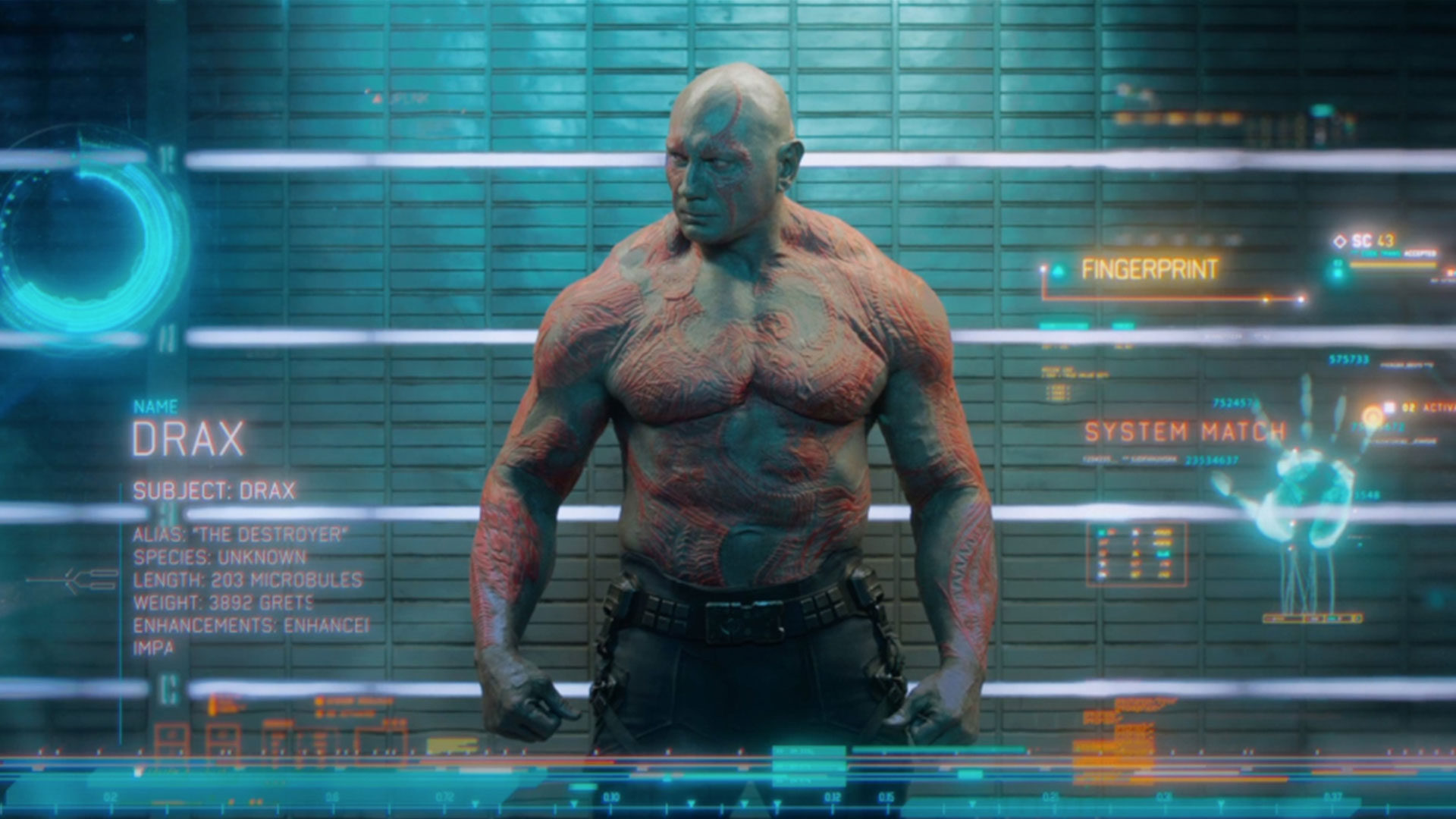
Yup, our logo was designed by Territory Studio. They’re the same team who created the animated screen graphics in Guardians of the Galaxy and Prometheus.
Excited doesn’t even begin to cover it.
The concept
As with any creative project, we first provided Territory with a brief describing in detail how HitFilm wanted to be perceived, our ambitions for the business and how our identity was going to be used. It also included references to tropes and images from the industry that we wanted to steer away from.
“As a creative studio, we get involved in varied array of work – from logo design to animated screen graphics for blockbuster films – and everything in between. Our approach when starting a branding piece of work is to dig down and try to understand the core proposition and values of a business,” says Lee. “This helps us create a coherent and exacting visual mark that encapsulates the essence of the business.”
The primary idea was to capture a feeling of “endless possibilities and a sense of play” to illustrate HitFilm’s multi-faceted application. This fitted neatly with the refraction effect and the use of color which Lee said was “an important aspect in some of Territory’s early thinking. I also directly linked to the color wheel used in HitFilm.”
When asked how many ideas and iterations he tends to go through when developing a concept such as the HitFilm brand, Lee says: “Because of the nature of our work, we’ve worked with a lot of business owners and understand that a company’s identity are a very personal thing. We presented 10 concepts initially (for HitFilm). This may seem like a lot but it’s essential to get an early feel for what resonates with the business. We prefer to have an open dialogue when developing further ideas.”
The design
Back in the HitFilm office, Territory’s concepts were shared around the team and immediately a triangular design stuck out as a clear favourite. A few minor tweaks were made, and the concept was sent back to Territory who continued to develop it.“We’re delighted with the new brand”, says Josh Davies. “Both subtle and bold, we feel that Territory has really understood what drives us and distilled that into a logo that reflects our vision and commitment to innovation and creativity”.
Being a software brand, one of the key considerations Territory Studios had was how the logo was going to look in a dock. To ensure that it stood out amongst a sea of other icons, Territory “developed a set of ideas based around strong geometric shapes to give a sense of impact and presence. We started looking at how color and the theme of ‘endless possibilities’ could be fused through the concept of refraction adding a jewel-like feel to the logo. During further development, special care was taken to retain the graphic nature of the symbol.”
This further development included producing lower res versions of the logo to use in places where the full refraction of the logo would not be seen or appreciated. For instance, for all HitFilm 3 Pro users, the type of logo you will see in your own dock will be the ultra simplified version on the far right, with the least refraction.
In addition to the actual visual stamp, we of course needed to re-consider the font that accompanies it. The HitFilm font had previously been quite chunky and thick in our old logo, so we wanted a more understated look, while retaining the same glassiness that exists in the refracted image. The result is a thin, sharp font that perfectly compliments the main visual.
Guardians of the Galaxy
Of course, designing the HitFilm logo wasn’t the only thing Territory Studio were doing in 2014. With every new project they secure, the team work hard to maintain their distinct design stamp. “It’s important to us that our design DNA permeates through everything that we do. We consider this to be the combination of good ideas with a highly crafted execution.”
Lee goes on to say that Territory’s “favourite project would depend on who you ask within the business but Guardians of the Galaxy sticks out (and is the most recent). We like projects that can involve all the different skillsets we have here at Territory. GotG allowed us to bring other designers into the film world. for instance, we created bespoke typeface designs to use in the screen graphics.”
As for me, I couldn’t possibly pick my favourite screenshots from Guardians of the Galaxy which feature their incredible visuals, so I just picked at random. If you want to see many more, take a look at Territory’s website.
")


So what’s next for Territory Studio?
“It’s an exciting time for Territory,” Lee adds. “We’ve recently taken on a fourth partner who heads up our ‘Experience’ part of the business. This means we can offer brand experience solutions across physical, digital, and motion graphics. We’re looking forward to the release of Ex Machina and Jupiter Ascending – two films we have worked on this year.”
Teasingly, Lee also adds that “there is also summer blockbuster we’ve been heavily involved in which we’re very excited about……”
Meanwhile, the team here have been applying the finishing touches to update #2 which should be arriving next week. Keep an eye on the blog for all the latest details. It’s another huge update, so you’re not going to want to miss it.